

Regression Model with TensorFlow
Beginner friendly blog for people new to tensorflow.


Regression Model with Tensorflow :
In this blog we will train a simple regression model on our own created dataset with tensorflow and try to understand all the concepts in depth.
Regression model : Regression analysis is a form of predictive modelling technique which investigates the relationship between a dependent (target) and independent variable (s) (predictor). This technique is used for forecasting, time series modelling and finding the causal effect relationship between the variables.
The ipython notebook for this blog is present here
Libraries we need for our model :
import tensorflow as tf
import numpy as np
import matplotlib.pyplot as plt
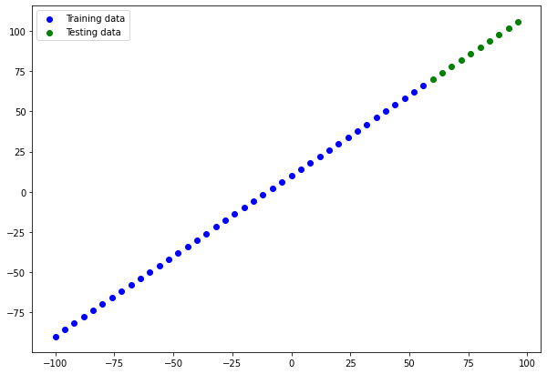
Let's create our regression dataset :
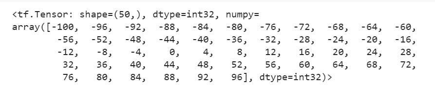
X = tf.range(-100, 100, 4)
X
y = X + 10
y
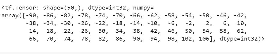
The simple relation between our training data and testing data is:
$$
y = X + 10
$$
Splitting our data into train and test split:
X_train = X[:40]
X_test = X[40:]
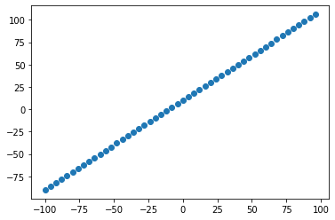
Visualizing our data:
plt.scatter(X, y)
Training our Models :
Model 1 :
For this model we will have 2 hidden layers with 100 neurons in each, the activation function which we will be using is "relu" -- Rectified linear Unit. The optimizer used will be "Adam" with a learning rate of 0.01. Trained on 200 epochs.
# 1. Creating a model
model_1 = tf.keras.Sequential([
   tf.keras.layers.Dense(100, activation="relu"),
   tf.keras.layers.Dense(100, activation="relu"),
   tf.keras.layers.Dense(1)
])

# 2. Compiling a model
model_1.compile(loss=tf.keras.losses.mae,
                optimizer=tf.keras.optimizers.Adam(lr=0.01),
                metrics=["mae"])

# 3. Model fitting
model_1.fit(X_train, y_train, epochs=200)
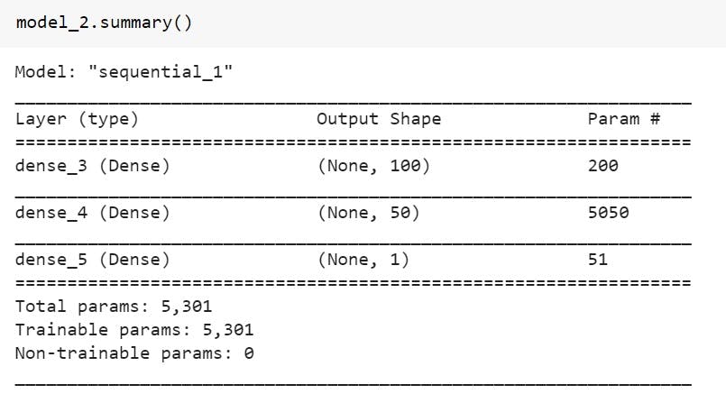
Model 2:
For this model we will have 2 hidden layers with 100 neurons in first one and 50 neurons in the second one, the activation function which we will be using is "relu" -- Rectified linear Unit. The optimizer used will be "Adam" with a learning rate of 0.01. Trained on 210 epochs.
# 1. Creating a model
model_2 = tf.keras.Sequential([
  tf.keras.layers.Dense(100, activation="relu"),
  tf.keras.layers.Dense(50, activation="relu"),
  tf.keras.layers.Dense(1)
])

#2. COmppiling the model
model_2.compile(loss=tf.keras.losses.mae,
                optimizer=tf.keras.optimizers.Adam(lr=0.01),
                metrics=["mae"])

#3. Fitting the model
model_2.fit(X_train, y_train, epochs=210)
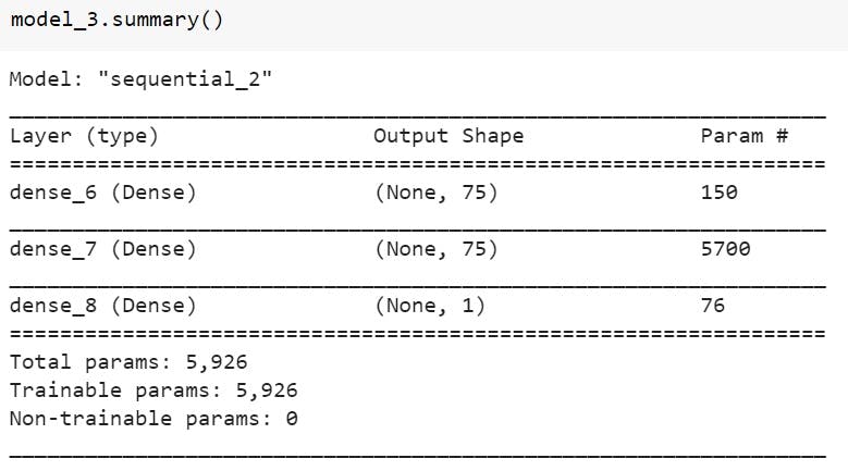
Model 3:
For this model we will have 2 hidden layers with 75 neurons in first one and 75 neurons in the second one, the activation function which we will be using is "relu" -- Rectified linear Unit. The optimizer used will be "Adam" with a learning rate of 0.01. Trained on 200 epochs.
# 1. Creating a model
model_3 = tf.keras.Sequential([
  tf.keras.layers.Dense(75, activation="relu"),
  tf.keras.layers.Dense(75, activation="relu"),
  tf.keras.layers.Dense(1)
])

#2. Compiling the model
model_3.compile(loss=tf.keras.losses.mae,
                optimizer=tf.keras.optimizers.Adam(lr=0.01),
                metrics=["mae"])

#3. Fitting the model
model_3.fit(X_train, y_train, epochs=200)
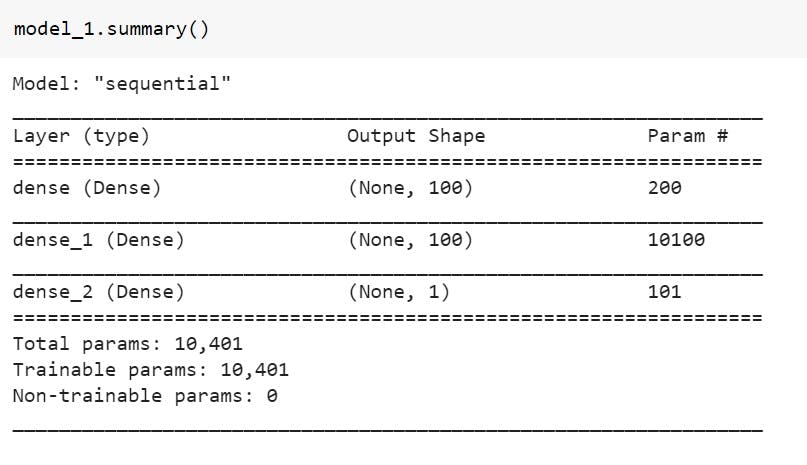
Summary of all the 3 models :
model_1.summary()
model_2.summary()
model_3.summary()
Visualizing our training and testing data together :
plt.figure(figsize=(10,7))
# Training data
plt.scatter(X_train, y_train, c="b", label="Training data")
# Testing data
plt.scatter(X_test, y_test, c="g", label="Testing data")
# Show a legend
plt.legend()
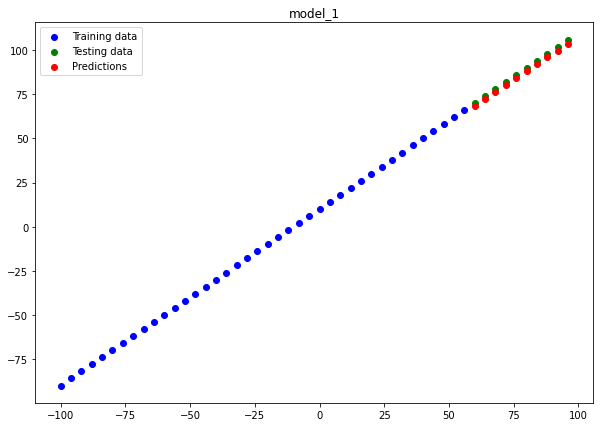
Predicting our data our test dataset :
y_preds_1 = tf.squeeze(model_1.predict(X_test))
y_preds_2 = tf.squeeze(model_2.predict(X_test))
y_preds_3 = tf.squeeze(model_3.predict(X_test))
Function to plot the prediction data on train and test data graph : This plots will help us to understand how our predicted data lies with respect to the actual data.
def plot_predictions(train_data=X_train,
                     train_labels=y_train,
                     test_data=X_test,
                     test_labels=y_test,
                     predictions=y_preds_1,
                     name="Model"):
  """
  Plots training data, test data and compares predictions.
  """
  plt.figure(figsize=(10, 7),)
  plt.title(name)
  # Plot training data in blue
  plt.scatter(train_data, train_labels, c="b", label="Training data")
  # Plot test data in green
  plt.scatter(test_data, test_labels, c="g", label="Testing data")
  # Plot the predictions in red (predictions were made on the test data)
  plt.scatter(test_data, predictions, c="r", label="Predictions")
  # Show the legend
  plt.legend();
Model 1 :
plot_predictions(predictions=y_preds_1, name="model_1")
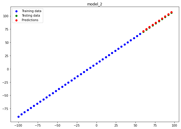
Model 2 :
plot_predictions(predictions=y_preds_2, name="model_2")
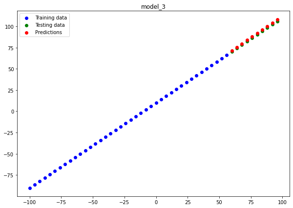
Model 3 :
plot_predictions(predictions=y_preds_3, name="model_3")
If you look closely our 2nd model model_2 almost perfectly fits the data hence, being the best model for us. Now let's save this model so that we can use the same model for similar kind of regression model.
Saving the model :
model_2.save("Model_2.h5")
To visit the files related to this blog visit - here